Tuesday, June 16, 2009

Project 3| Art Gallery| Final models and drawings

Three access for the programs: The design allows the gallery, workshop and aparment worked as one coherent space or used as a seperate space. The gallery is at the front of the site, accessed on King's Street. The workshop and office is under the roof terrence and can be accessed from the carpark. The aparment is at the back, facing the park, with seperate access from Lenonx Street.


Façade:
The entrance is recessed. To excite the visitors with the sculptures even before they enter the gallery, the they go through the display tunnel shaped as “C” that is the initial of the artist’s surname. The façade is transparent. Passers-by can see some exhibits through layers of glass from the street.
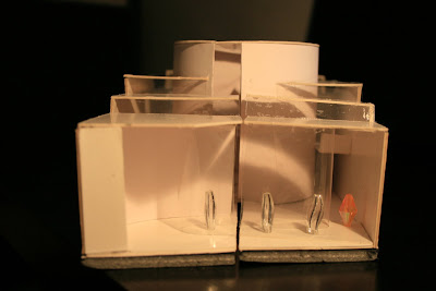

Roof Terrance: The pool is the center of the roof terrance for displaying floating scupltures. It is also used as a private garden for the art dealer's apartment when the gallery is closed.


Circular Installation Room


Central Exhibition Room: Double height exhibition space for Chihuly's big scupltures which can viewed from ground and first level.


Apartment: at the back of Site 1. Faces the park. Kitchen facilities is adjacent to the courtyard and can be used for gallery function held in courtyard.


Drawings:


Floor plans and sections 1:100 on A1 paper


Plan and Section of Gallery next to courtyard. 1:50 . Daylight is diffused to the room through the special designed skylight. Instead of using direct sunlight, the diffused lighting is more suitable for gallery use.

Perspective of Central Exhibition Room with double-height connecting to levels.

Project 3| Art Gallery| Artworks & Concept

Artist: Dale Chihuly

Chihuly is a contemproary glass artist. His works are exhibited in museums and public space worldwide.


Concept
In this project, I explored the idea of transparency in the gallery. Light is crucial to exhibit glass sculptures. Without light, the glass sculptures are liveless. One of the challenges in this project is to draw in natural light to the gallery. Due to the sandwiched site, skylight would be wisely used to bring daylight to the south-facing shop front.

Tuesday, May 19, 2009

Project 3| Site Analysis

Site 1 is chosen. The site faces King's Street and backs at Lennox Street. It can be accessed through the carpark also at the back. In view of this, three access is designed for the gallery. It can provide sepearate access to different users when needed.

The site is long and narrow, with 12.6 meters wide and 85 meters long. It is sandwiched by the building from the left and right. The back is north-facing. Natural lighting would be captured from the back. Speical design to the skylight is needed to pull daylight to the shop front.

King's Street is a busy street. It's the main street in Newtown. At the back, there is a quiet park on Lennox Street, opposite to the site. From program perspective, the gallery in the front can attract more customers and the aparment can enjoy some privacy and tranquillity. One thing needs to deal with is the transition from the busy street into the gallery.

Project 3| Precedent Study

1) Museum of Anthropology , University of British Columbia (1972-76)
Arthur Erickson


Design Concept:
create conditions similar to the settings of the native Indian villages which were the origin of the museum’s collection. The transition from dark towering woods to bright exposed sea provided a dramatic setting. Experience of visiting can be likened to a metaphor of the journey through life and through a Northwest coast village.


Entrance

  • As one proceeds from the brightness of the parking clearing into the museum, the openness to the sky is gradually cut off, first by trees that form a channel to the entrance, then by free-standing post-and-beam frames, then by the ceiling of the lobby.
  • Views opening out into the woods from lobby through floor-to-ceiling glass and skylight slots also bring daylight down to the exhibits, revealing them as they would be revealed in the forest by filtered light from above.
  • Experience of light in lobby similar to that in deep woods where you can see through clearings and light filters through tree canopy overhead. Visitors are prepared to enter into the deep forest (main gallery).

    Circulation/ Sequence of space
  • Sequential experiences of the rooms are created by alternating dark and light exhibiting space and there is a tension created between inside and outside.
  • After through the contracted sequence of entry lobby and the ramped gallery, visitors experience a release to the light-filled Massive Carvings Gallery that suggests a village site.
  • Ones leave the life and light of the village enters the contracting space of the Koerner Gallery, the setting for symbolic and sacred objects used in spiritual ceremonies.
  • On the journey back to the beginning, one is attracted to the focus of the centrepiece sculpture “The Birth of Man”, surrounded by darkness but lit up the circle skylight. The sculpture represents birth also suggests the death and the endless continuation of the cycle.


    Lighting
  • Many different ways of admitting light, different patterns of light and different levels of illumination are employed to provides the visitors with the experience of native village and display artifacts.
  • Light from above: Entry Lobby, Ramped Gallery, Massive Carvings Galler.
  • Light from side: Entry lobby, Great Cavings Gallery, Koerner Masterpiece Gallery
  • Light delineating structure: Massive Carvings Gallery
  • Light dematerializing structure: Dappled light in Koerner Masterpiece Gallery
  • Light washing surfaces and silhouetting forms: Ramped Gallery

    Learning:
  • Close relationship between the ambience of the exhibiting space and the arts displayed.
  • Re-create the native settings of the artifacts through inter-play of light and dark.
  • Interplay of form through expansion/ contraction of space and lighting (light-to-dark-light) create the sequence of space and guide the visitors through the museum.
  • There is a rhythm of light and dark at the building scale and a particular rhythm for each room.

Tuesday, May 12, 2009

Project 2 | Drawings & Model

Model

Materiality: dark red Helsingborg bricks that have the quiet strength of unadorned masonry

Openings
Openings are designed with careful thoughts to allow glowing spaces to appear within a dusky ambience. The retreat is lit up by natural light from the skylight, wall/ ceiling slits and the sole window.

1) Skylight over the arcade to the lookout
Shadow of the south-facing frames in the arcade forms a rhythm and changes vividly during the day.
2) Framed lookout

The lookout is designed with the idea of a pin-hole camera. Four sides of the box-shaped lookout is closed with the window opening facing the beatufiul view of the pond. When the photographer stands in the lookout, he is merged with the window fames becoming part of the picture.


3) Wall slit created by interseting wall.
Streak of sunlight into the meditation room at sunrise.


4) Wall Slit formed by connectin wall

Stream of sunlight into the meditation room at sunset.


5) Entrance

Arrival is a shadowy closed outdoor journey lit from above. The closed and narrow entrance formed by curved and straight lines cast interesting shadow.

Drawings
Plan 1: 50


Section 1:50


Axonometric Drawing

Project 2 | Design Concept, Sketches and Precedent Study and

Design Concept
The photographer uses his lens to frame his experience every day, which forms the design concept of the meditating retreat for him. Frames are used as the design element to create contemplative light in the retreat. The arcade leading to the lookout is formed by a series of frames to create a rhythm, which is a more vivid space in the retreat. The lookout that provides a space for the photographer to enjoy the natural landscape and its opening is framed like a painting. The meditating room (quarter of circle) is enclosed and dark for the photographer to stay calm and contemplate. It is not a complete darkness and daylight spills in from the skylight of the arcade in the mid-day. The wall slit is carefully framed to allow the first streak of light to wake the photographer up in dawn and ends his day with the last presence of sunlight in sunset.

Sketches

Parti
The geometry and curve of the fireplace in the painting is the trigger. The form of the retreat is derived by the intersection of a rectangle and a sector of a circle.

Light Study
Light and shawdow bring atmospheric richness to a mood of tranquity and solitude
The meditation room is illuminated by slits from the linear and curved walls.
The arcade is lit up by the skylight and the framed lookout.


Elevation
The west facade has the sole window in the retreat. The window/ lookout is designed with the idea of an old-fashion pin-hole camera.


Precedentudy Study

I was inspired by Tando Ando’s Church of Light. I am interested how light reveals meaning to the space. The interplay of light and dark makes the space divine and sacred.

Church of Light (1989) - Tadao Ando


Project 2| Painting and Narrative

Narrative

"A retreat for a journalistic photographer who pursues inner peace and seeks to escape the city. "
Ambience of Room and Narrative:

The inspiration for the journalistic photographer arises by stepping into the perspective of Edward Hopper who framed the woman in her bedroom with his own psychological state and emotions. The ambience of the Summer Interior is transformed into the introverted photographer who used his lens to capture his dejection and desire for escape in photos. Photography is literally drawing with light. The retreat is a tranquil and private space that provides the busy photographer with a chance to search for his true self, contemplate and refresh himself in solitude.

Site
In a pine-topped forest with a pond nearby, Old Chatham, New York

In summer, the tree leaves take on a deep hue, absorbing the sunlight. The lawn in shade frames the trees at the end of the pond catching the low rays of the sun.

In winter, the sky is deep blue, the bottom of the woods lost in darkness as the noon sun casts long shadows over the lawn and pond. The contrasts are intense.

Old Chatham in Summer


Old Chatham in Winter


Painting Summer Interior (1909) by Edward Hopper
About the painting:

It is the first of a long series of paintings of women in bedrooms by Hopper who liked to introduce narrative ambiguity to his works. It is a private scene of a semi-nude woman crouched by the bed feeling unsettled and contemplating. She faced backward to the windows which could be the source of light and buried herself into her own world. Unlike other artists who painted the female nude to glorify the female form and to highlight female eroticism, Hopper's nude was a solitary woman who was psychologically exposed. Her loneliness, regret, boredom, and resignation filled the dark small bedroom. Hopper turned light into an interesting object. The long rectangle light that casts on the floor is sharp and bright, in contrast to the emotions of the woman. Like a photograph, Hopper captured the intimate moment by stealth; the character did not seem to know she was being observed.

Hopper stated “Great art is the outward expression of an inner life of the artist, and this inner life will result in his personal vision of the world. The inner life of a human being is a vast and varied realm.”